
A new look for a new era: Introducing our new brand identity
At uSource, we’ve always believed the service industry is built on a simple foundation: people receiving reliable help from expert hands. Our original branding represented structure, stability, and a strong corporate foundation. As we moved into 2026, we realized our visual identity reflected who we were at the time, but not the full momentum of who we are becoming.
Today, our new branding is a response to the shifting landscape of the modern service economy and a commitment to solving the pain points our consumers face every day. uSource is evolving into something more dynamic: a network designed to connect homeowners with service pros, built around accessibility, speed, and human connection.
With our marketplace introduction and our ambition to become “the app for everyday services,” it became clear that our visual identity needed to evolve alongside our growth.
Our new visual identity is designed to strike that balance: trustworthy and warm, professional yet consumer‑centric. It moves us away from formal perceptions and toward a modern, transparent, and transformative approach to service fulfillment.
Why We Decided to Revisit Our Rebranding Strategy
The decision to embark on a brand redesign wasn’t made overnight. It emerged from a deep analysis of the challenges homeowners and service providers face when they struggle to find reliable help or consistent clientele for everyday services. When we looked at the data, the need for a more "human" brand became clear:
- The Callback Void: According to the Global Customer Service Report by Microsoft (in 2017), 72% of customers demand immediate service, yet many professionals take days to respond or never call back at all.
- Pricing Anxiety: In 2023, a survey by Experian found out nearly 70% of adults feel they have suffered or are currently suffering from financial trauma due to a lack of pricing planning and of transparent, upfront quotes.
- The Labor Shortage: The US faces a critical shortage of licensed tradespeople, such as a projected deficit of 550,000 plumbers by 2027, leading to long wait times, according to an analysis by John Dunham & Associates.
- The Trust Deficit: 38% of homeowners rank communication problems, like late arrivals and scheduling difficulties, as their top frustration, outranking even price, in 2025.
Our rebrand strategy aims to bridge these gaps. We aren't just a "centralized home services marketplace"; we are a network built on trust. Our new look signals to our community that we are here to remove complexity and deliver frictionless technology where great service feels effortless.

The Design Process: From Square to Rounded
During the design phase, our professional team explored several options. The goal was to find a design that represented what uSource does as a whole while remaining adaptable to present and future product business lines.
We intentionally moved away from sharp, "square" edges. Why? Because sharp corners feel institutional and rigid. Rounded edges, on the other hand, are inherently more friendly and approachable. Our new, more colorful palette reflects the vibrancy of the communities we serve. This isn't just a logo change; it's a visual promise of "Innovation with Purpose."
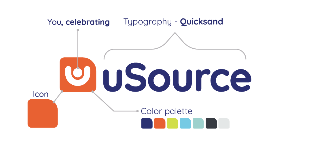
The Anatomy of the uSource Logo
Our logo is more than just a mark; it is a visual representation of the connections we build. Below is the breakdown of the elements that define our identity.
Typography
We selected Quicksand, a rounded sans-serif typeface. It was chosen to represent modernity and a consumer-friendly, approachable feel. Its rounded edges make it versatile and timeless, ensuring it remains easy to read across all digital and physical platforms.
Color Palette
- Deep Blue: Represents confidence, technology, professionalism, and stability.
- Vibrant Orange: Symbolizes warmth, energy, enthusiasm, and the spirit of creativity.
- White: Represents cleanliness, neutrality, accessibility, and the promise of new beginnings and opportunities.
The Icon
The icon is you. It is a person, representing every individual user on our platform. As well as:
- Inclusivity: It represents everyone, from the homeowner living alone or the young newlywed couple to the service professional looking to grow their business.
- Celebration: The figure is raising its hands in a gesture of success. For the homeowner, it’s the relief of finally finding a verified, reliable professional. For the service provider, it’s the celebration of more clients and increased income.
- Connection: Ultimately, this icon celebrates the thousands of human connections created through our platform every day.
Action-Oriented Vocabulary
Our new brand is driven by four key verbs that act as the engine of our copy:
- Fulfill: Our team of expert pros, tackle your service needs efficiently.
- Request: Fast and simple online process gets you the help you need.
- Connect: We help you find pros in your area. No contacts required.
- Deliver: Because we all deserve a better customer experience.
In closing, we are more than an app; we are where the service industry meets simplicity. We invite you to explore the new uSource website to see our new look in action.
The world is changing, and your service experience is evolving too. Welcome to the new uSource.
Find. Hire. Done.